Scientific Visualization of E3SM’s Cryosphere Campaign Simulations
 High-quality visualizations of climate simulations are a vital tool for providing scientific insight and for communication with stakeholders and the public. Here we discuss early results from the Cryosphere-Ocean Visualization Project, which brings together experts in scientific visualization and domain scientists in climate, ocean, and land ice modeling.
The broad goals of the E3SM Cryosphere science campaign are to understand the dynamics of the Earth’s polar regions and how changes in Earth’s cryosphere may impact the broader climate system and ultimately, society. Currently of particular interest are interactions between the Southern Ocean, Antarctic ice shelves, and the global climate system. Ice shelves form where Antarctica’s ice sheets thin at their seaward margins and go afloat by buoyancy. When relatively warm Southern Ocean waters circulate in cavities beneath the ice shelves (the two largest of which are each approximately the size of Texas), the waters can melt and thin the shelves from below; increased melting and thinning of ice shelves can occur when broader regional and global climate changes bring more warm water into contact with the ice shelves. Ice shelves are still connected to the ice on land and, as such, exert a strong influence on the dynamics of the ice sheet, primarily by resisting the flow of ice from land into the ocean. When ice shelves thin, this resistance is diminished, more ice is lost to the ocean than forms from new snow, and global sea levels rise. Changes in the amount of freshwater entering the Southern Ocean through ice shelf melting and iceberg calving also have significant impacts on global climate through changes in global ocean circulation.
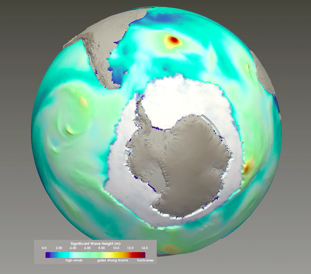
Figure 1. How to represent Antarctica and its vastness? The visualization team is concerned about providing visualizations of Antarctica that might perpetuate the incorrect stereotype that it’s a very small island. In order to express the vastness of the continent, the team is identifying ways of visually representing the continent highlighting its true scale. The team is exploring the possibility of representing the continent with the curvature of the earth and minimizing the exaggeration of elevation where possible. This prototype image represents a step toward this goal. (Image provided by Phil Wolfram and Francesca Samsel.)
MPAS–Albany Land Ice and MPAS–Ocean
E3SM includes components for modeling the physical evolution of the atmosphere, ocean, sea ice, land, and land ice. As noted above, the E3SM Cryosphere science campaign focuses on the land ice, sea ice, and ocean components (broadly encompassing “the cryosphere”), which are built using the Model for Prediction Across Scales (MPAS) climate modeling framework and allow for variable resolution meshes. The MPAS–Albany Land Ice (MALI) model simulates the dynamics of the Antarctic Ice Sheet, which is up to 4000 meters thick in its interior and covers the entire continent. Ice flows slowly from these high, central regions increasing to speeds of several kilometers per year as it coalesces into outlet glaciers and ice streams. In turn, these feed into the vast floating ice shelves that accelerate and thin as they spread out over the ocean, eventually melting from the ice-shelf base or calving off into icebergs.
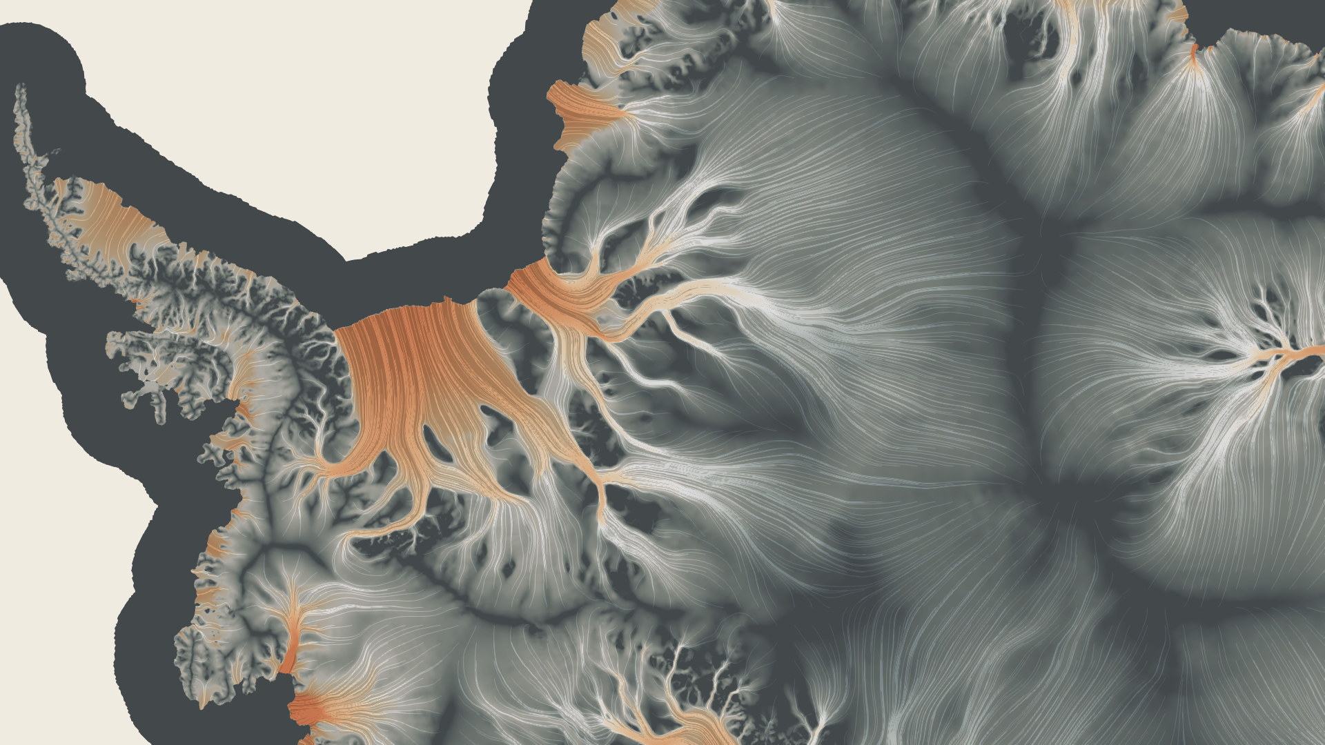
MPAS-Ocean simulates the dynamics of the global ocean and, critically for the Cryosphere science campaign, the ocean circulation within the cavities beneath the ice shelves. This is necessary for capturing the exchange of heat and freshwater between the ice shelf and ocean that impacts the dynamics of both the ice sheet and the Southern Ocean. The rate of ice-shelf melting is a function of the ocean temperature, salinity, the pressure of the water at the ice shelf base, and the speed of the ocean currents, all of which change on a wide range of timescales and in response to a wide range of local, regional, and global climate forcings. MPAS-Ocean and MALI are currently run separately and are forced by historically observed changes in climate and initialized with the observed ice sheet and ice shelf geometry. Ongoing work focuses on coupling these two components within E3SM so that changes in the ocean, ice shelves, and ice sheets interact dynamically and feed back on one another.
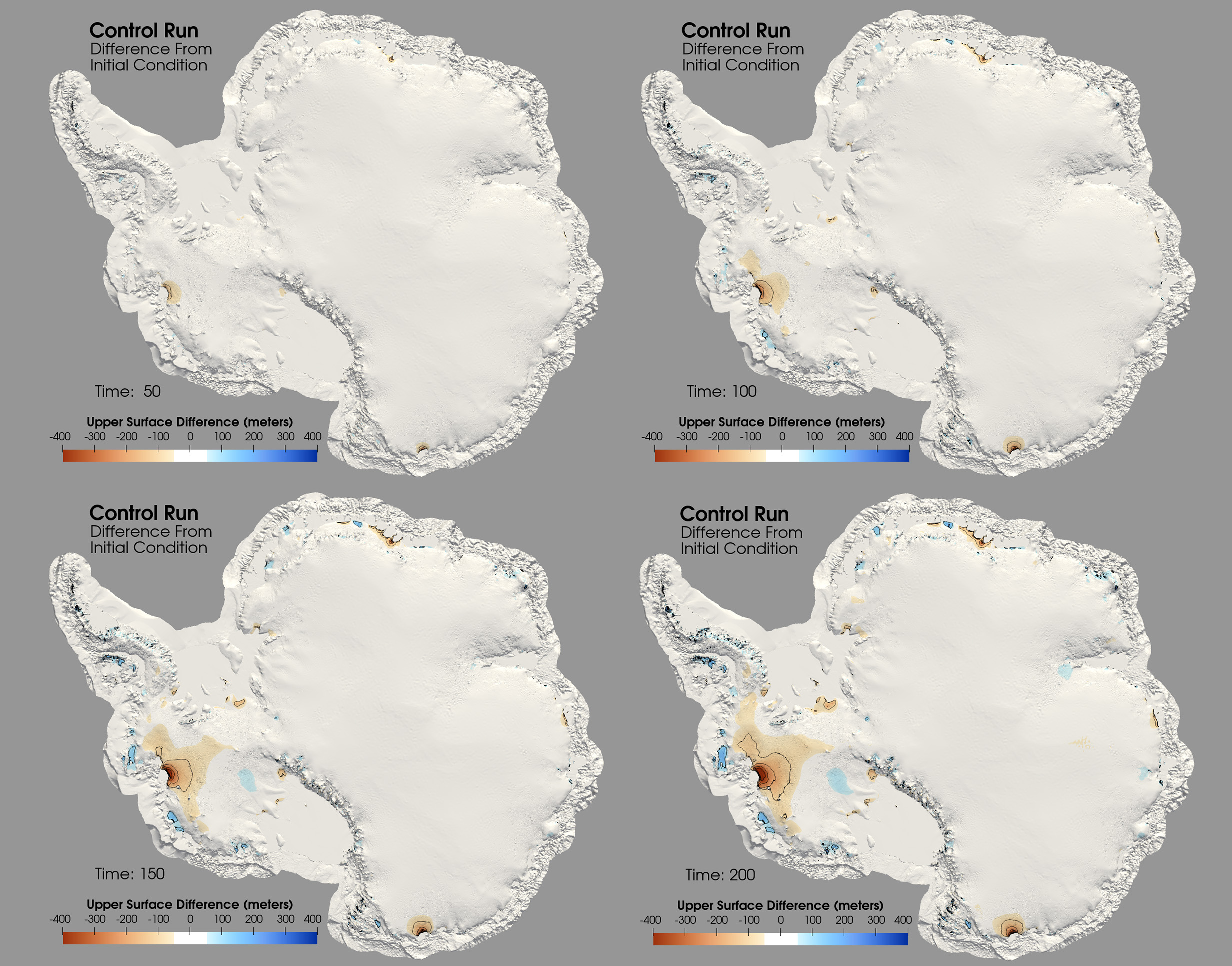
Figure 2. Change in the ice’s upper elevation from a control simulation based on present-day initial conditions and climate forcing (snow accumulation and sub-ice shelf melting). Panels show snap-shots 50, 100, 150, and 200 years after the start of the simulation. The visualizations show the upper surface of the ice, at each time step, vertically warped by a scale factor of 30. Where the ice elevation changes by at least 50 meters from the initial conditions, it is colored red for loss and blue for gain. Contour lines are drawn at every 100 meters of gain or loss. The red region with progressively decreasing surface elevation over time represents the simulated progression of present-day mass loss observed in the Amundsen Sea Embayment due ongoing thinning of the Pine Island and Thwaites Glaciers.
The scientific goals of the E3SM Cryosphere campaign require realistic, high-resolution simulations of the interactions between the ocean and ice sheets on both regional and global scales. A primary goal of the project is to be able to project the impact of changing melt rates on ice shelf thinning and in turn the resulting impacts of ice sheet mass loss on sea level rise. The Cryosphere–Ocean Visualization Project is supporting E3SM’s Cryosphere simulation campaign through cutting-edge visualizations for both improved scientific understanding and improved communication of E3SM science to policy makers and the public.
Data Sets
The overarching goal of the Cryosphere–Ocean Visualization Project is to use advanced visualization and analysis tools to develop a better understanding of the Antarctic Ice Sheet’s response to forcing from the Southern Ocean. So far, the team has visualized Antarctic Ice Sheet results from three MALI ice sheet simulations, each run forward in time 200 years from initial conditions approximately consistent with the present-day.
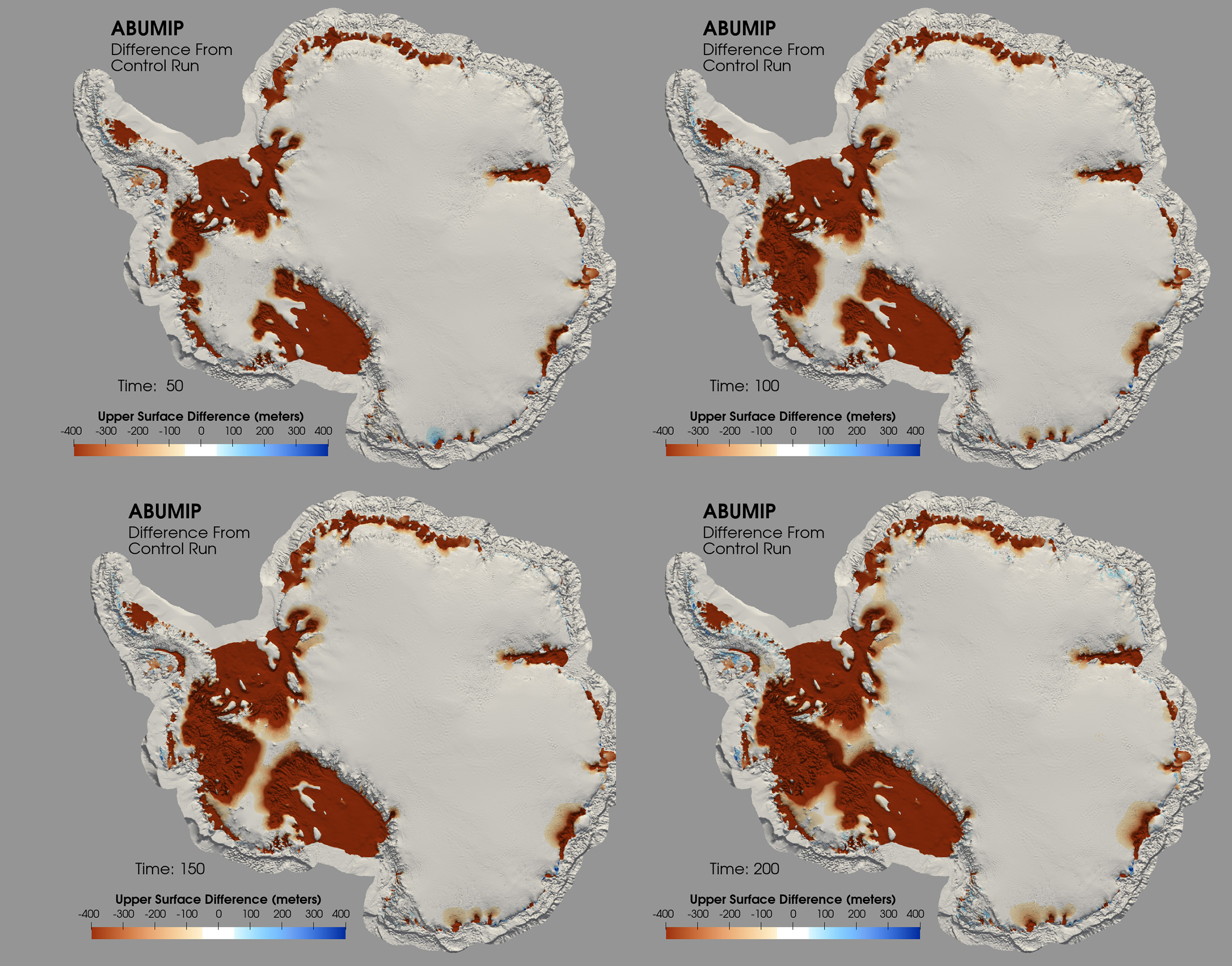
Figure 3. Results showing differences between the Antarctic BUttressing Model Intercomparison Project (ABUMIP) simulation and the control simulation 50, 100, 150, and 200 years after the start of the simulation. ABUMIP is an estimate for how the ice sheet evolves if all of the ice shelves are removed instantaneously, which provides an upper-bound on Antarctica’s dynamic response to ice shelf loss. The upper surface of the ice is vertically warped by a scale factor of 30. Note the extreme loss of ice on the slopes surrounding the ice shelves. The colormap makes a clear distinction where there is ice loss (warm colors) rather than gain (cool colors).
The first is a control run forced with ocean and atmosphere conditions consistent with historical observations, leading to the most moderate of the three simulations. The second, from the Linear Antarctic Response to basal melting Model Intercomparison Project (LARMIP), is similar to the control run in most parts of Antarctica, but includes warmer ocean water flowing into the cavity beneath the Filchner-Ronne Ice Shelf, providing an example of the Ice Sheet’s response to aggressive melting and thinning of (just) the Filchner-Ronne Ice Shelf. The third MALI simulation, from the Antarctic BUttressing Model Intercomparison Project (ABUMIP), represents an upper-bound on Antarctica’s dynamic response to ice shelf loss by instantaneously removing all of Antarctica’s floating ice shelves and not allowing them to reform.
Combined, these three simulations provide a spectrum of Antarctic Ice Sheet response to ocean forcings on the ice shelves. Figure 2 shows four time steps from the control simulation. The visualizations show the elevation of the ice surface colored by the difference from the initial condition after 50, 100, 150, and 200 years of simulated time. Modest change has taken place after 200 years. The LARMIP and ABUMIP datasets, as seen in Figures 3 and 4, are colored by the difference from the control at the synchronized times of 50, 100, 150, and 200 years. Both show aggressive ice loss in the catchment areas of the affected ice shelves.
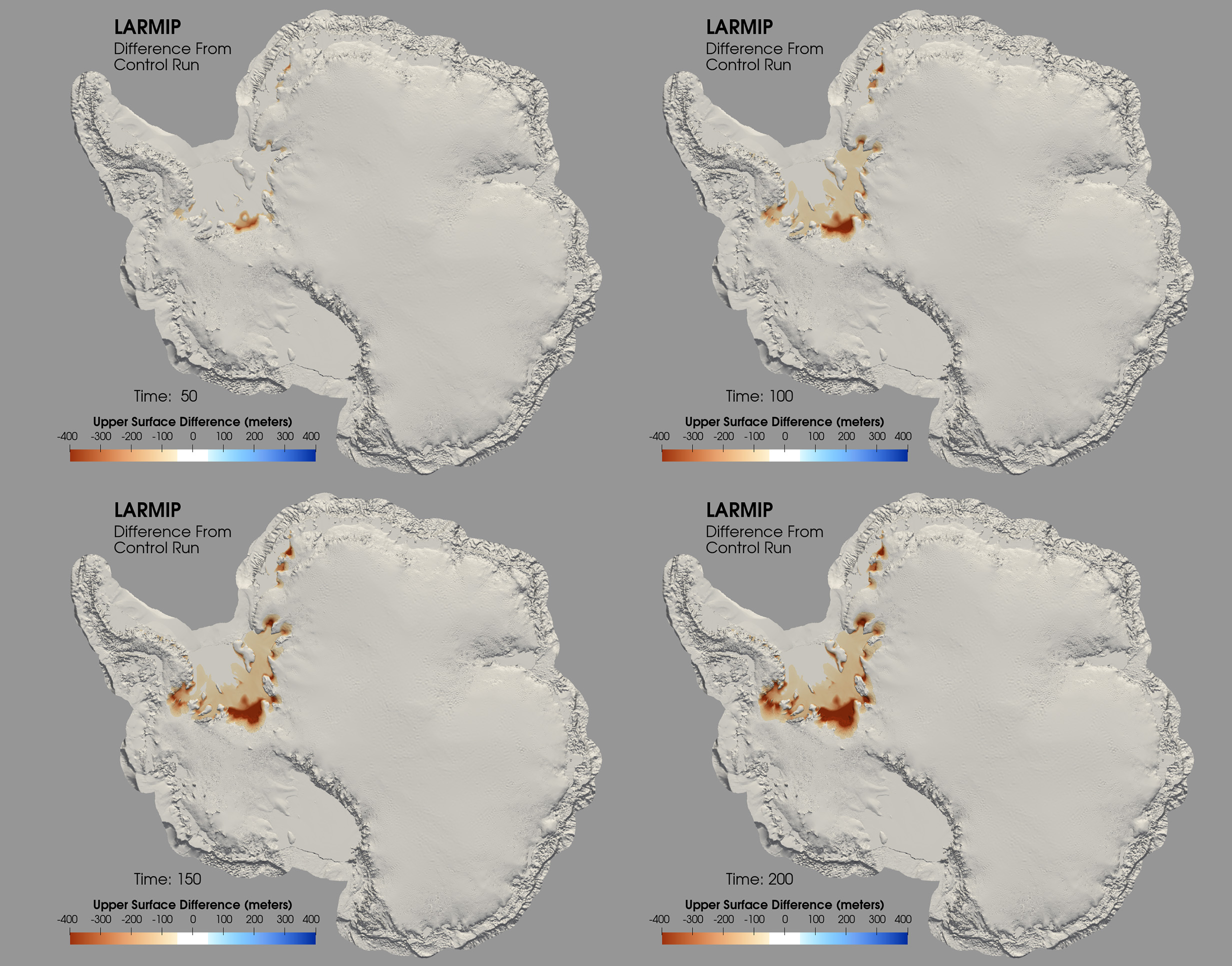
Figure 4. Results showing the difference between the Linear Antarctic Response to basal melting Model Intercomparison Project (LARMIP) simulation and the control simulation 50, 100, 150, and 200 years after the start of the simulation. The upper surface of the ice is vertically warped by a scale factor of 30. This particular LARMIP simulation represents the impacts of rapid thinning of the Filchner-Ronne Ice Shelf on the grounded ice sheet. Note that the aggregate ice loss is focused on the Filchner-Ronne shelf and in the surrounding catchment areas.
The visualization team has two data sets from MPAS–Ocean runs that show interaction with land ice. Both ocean data sets include the cavities beneath Antarctic ice shelves in the ocean domain. The first ocean data set treats this ice shelf cavity as inert rock, that is, there is no forcing (heating, cooling, freshwater influx) at the ice-ocean boundary. The second data set includes a parameterization of the cooling and influx of freshwater from melting ice into the ocean beneath ice shelves.
The three MPAS–Albany Land Ice and two MPAS-Ocean simulations provide the data upon which the visualizations are built. By combining the separate ocean and ice sheet data sets, the visualizations allow researchers to see what is happening under the ice sheets, how the ice sheets respond to the flowing ocean waters, and how the ocean responds to the floating ice.
Cryosphere–Ocean Visualization Project
The goals of the Cryosphere–Ocean Visualization Project are to study the simulations discussed above and provide visualizations that are of interest to the cryosphere ocean domain scientists and their communities, the broader scientific community, their program managers, and the general public. The visualizations will be accessible and reproducible to stakeholders using open-source tools. The team is working toward a video consumable by the general public that tells the story of ocean and land ice climate simulations, is run on supercomputers, and is being used to study the mechanisms of sea level rise. The video script focuses on the following main points:
- Ocean circulation beneath Antarctica’s floating ice shelves influences their melt rates and thinning
- Ice shelf thinning reduces the ice shelves’ ability to restrain the flow of ice farther upstream, increasing the ice sheets’ inland rates of flow
- Increased rates of flow increase the rate of ice sheet thinning
- For much of Antarctica, increased thinning triggers further flow acceleration and further thinning (a positive feedback referred to as the “marine ice sheet instability”)
- Antarctica’s ice sheets store many tens of meters of sea level equivalent
- Thinning of the ice sheet translates directly to increased rates of sea level rise
- Coastal population centers around the world are at significant risk of future sea level rise
Generation of Visualizations
The team uses ParaView, an open-source, state-of-the-art, parallel distributed memory visualization tool with significant DOE investment and the existing tool of choice for analysis of E3SM ocean-ice components. It supports reading, processing, rendering, and exporting data in many standard formats, including the unstructured and variable resolution mesh structures used by the E3SM components. A key feature of ParaView is its ability to save and restore states from a descriptive text file or from code via a script. Features like these are essential for reproducibility, visualization imagery version control, and using an iterative process for image production. ParaView has both scripted and interactive graphical user interfaces.
As a step toward reproducible visualizations, the team developed a capability in ParaView that allows members to save the current state, a screenshot of the current state, and a text file all with the same base name but with their respective extensions (.pvsm, .png, .txt) with a single button click. These files are added to a directory for this project that is managed by git and then checked into a repository. The team developed a simple web-based viewer that allows the .pngs to be viewed and easily linked to their respective ParaView state files. The text file can be easily read, edited, and searched.
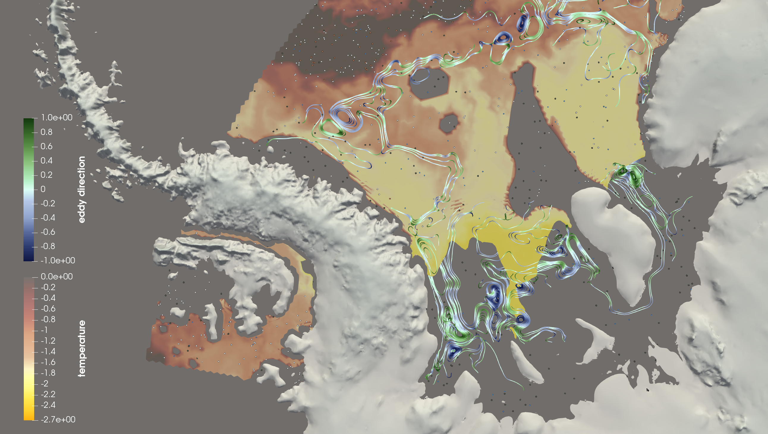
Figure 5. This visualization illustrates some of the dynamics of ocean circulation beneath ice shelves. An isosurface of constant depth is colored by ocean temperature below the floating Filchner-Ronne Ice Shelf. The surfaces are vertically warped by a factor of 30 (i.e. the topography is exaggerated by 30 times). Streamlines are seeded on a line that crosses underneath the ice sheet exposing the movement of ocean water below the shelf. There is another streamline seeding across the continental shelf. They are colored by the cyclonic direction using a scalar value varying between 0, where the streamline is straight, to a maximum of +- 1, where the streamline takes on its maximum curvature. The speckling represents an R&D effort to identify categories of water masses.
Visualization Techniques
The primary visualization techniques used for this work are isosurfaces, streamlines, and warping by scalar fields. ParaView makes these available as filters that can be applied to data before extracting geometry for rendering. All available scalar fields that intersect the new geometry are retained and can be used for coloring the visualizations.
Isosurfaces or contours are a common visualization technique that calculates a surface of constant value through a volume. It is analogous to an isoline or contour line which shows a line of constant value in a 2-dimensional space, such as contours of constant elevation on a topographic map. Figure 5 uses an isosurface of constant depth that is colored by temperature to create a visual backdrop for the streamlines, explained later, showing ocean flow. The goal of Figure 5 is to develop an intuition in the viewer that there is a dynamic ocean beneath the ice shelves and interacting with the ice shelves.
Streamlines are a visualization technique for vector fields such as those describing fluids. They are lines that are produced by “seeding” a starting point in a vector field, then propagating a line from that starting point that is tangential to the vector field at all times, showing a path in which the water is flowing. For the ocean in Figure 5, this develops an intuition that there are currents and eddies. The streamlines are colored using a divergent colormap so that both the degree (values between 0 and 1, Fig. 5) and direction of curvature (positive or negative, Fig. 5) are evident. This allows ocean scientists to discriminate between blue cyclonic or clockwise and green anticyclonic or counterclockwise eddies in the flow field. For the ice in Figures 6 the seeding and streamlines develop an intuition of the direction of the flow, topography, and the catchment areas. The streamlines are colored by velocity so they are also indicating where the ice flows slowly and quickly. Streamlines can be calculated both forward and backward from a seed point. The streamlines for the ice are calculated forward only. The streamlines for the ocean are calculated both forward and backward.
Warping by a scalar allows a 2-dimensional surface to be extruded in a third dimension. This is mostly seen in Figures 1, 2, 3, 4, and 5 in the topography of the land. In these figures, every image of the Antarctic surface has been warped to create a visual sense of elevation, a sense that the 2-dimensional map of the surface is embedded in a 3-dimensional space. This warping, necessary to show the extreme elevations in Antarctica at this scale, is problematic. As the warping is increased, the perception of the size of the continent seems to decrease. Figures 2, 3, and 4 are exaggerated by 30 times to create this sense of elevation.
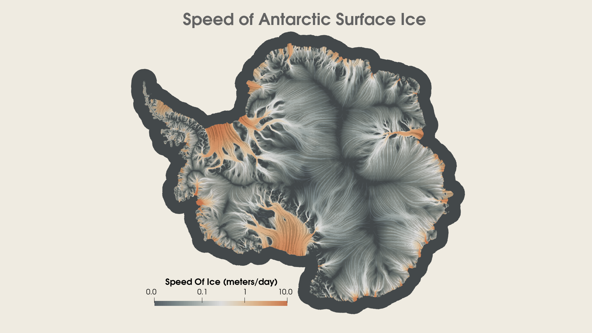
Figure 6. Flow of the Antarctic Ice Sheet as simulated by MALI. This represents a current best approximation of the ice sheet’s state when optimized to present day observations of geometry and velocity. Evenly seeded streamlines, colored by speed, can be used to identify flow divides and “catchment” areas (dark grey / black regions in the ice sheet interior).
Summary
The Cryosphere-Ocean Visualization Project has produced a variety of visualization products for evaluation by the science team. Most of the products are available as image or movie files; they all have ParaView state files or python code available to reproduce the content. This iterative process with the science team is ongoing and is currently focused on developing an explanatory video for the Supercomputing 2020’s Scientific Visualization and Data Analytics Showcase. That video will be publicly available in November and shown at the conference.
Computing Resources
- Texas Advanced Computing Center (TACC)
- Los Alamos National Laboratory’s Institutional Computing (IC)
- Los Alamos National Laboratory’s Information Science & Technology Institute (ISTI)
- ASCR Leadership Computing Challenge (ALCC) awards to the E3SM Cryosphere campaign team, supporting the simulations noted above conducted at the Argonne Leadership Computing Facility (ALCF) and the National Energy Research Scientific Computing Center (NERSC)
Funding
- DOE’s Office of Science, Biological and Environmental Research (BER), Earth and Environmental Systems Sciences Division (EESSD), Data Management Program, Scientific Visualization in Support of the E3SM Cryosphere Simulation Campaign Project
- DOE’s Office of Science, Scientific Discovery through Advanced Computing (SciDAC), RAPIDS Institute and ProSPect project
- Los Alamos National Laboratory’s Advanced Simulation Computing (ASC) program
Scientific Visualization Team:
- John Patchett and Kieran Ringel , Los Alamos National Laboratory
- Francesca Samsel and Greg Abram, TACC
- Aashish Chaudhary, Dan Lipsa, and Jelly Wang, Kitware
E3SM Climate Science Team
- Stephen Price, Matthew Hoffman, Mark Petersen, Xylar Asay-Davis, Los Alamos National Laboratory
Contacts
- John Patchett, Los Alamos National Laboratory


